Lueur Beauty
Client
Lueur Beauty, Fictitious Perfume Brand
Deliverables
Brand Identity
Packaging Design
Goals
Create a Versatile Brand for Several Scents
Design Functional and Beautiful Packaging
Create Eye-Catching Product For Purchase
My Role
Structural Packaging Designer + Graphic Designer
Accolades
"Kiss Goodnight" won First Place in the 2020 PIASC RAISE College Level Packaging Competition.

My Cal Poly Packaging class was assigned a project to create packaging for a fictional perfume or cologne brand. To culminate the project, my classmates and I were to submit our designs in a competition hosted by the Printing Industries of Southern California (PIASC).
The competition required a box that fit a perfume bottle of our choice, and required a matching label for the bottle. I ended up creating two designs, and submitted the design 'Kiss Goodnight' to the competition, where I won first place.
Lueur in French means 'to glow', so I thought it would be the perfect word to represent a beauty and perfume company.
About Lueur
Process
Project Steps
Research Perfume Bottles and Boxes
Brainstorm and Sketch Ideas
Order Perfume Bottle
Select Dielines
Design Pattern and Initial Branding
Size Dielines to Perfume Bottle
Place Art on Dielines
Class Critique / Created New Color Palette
Formal Separation of Both Perfume Scents
Creation of Labels for Both Scents
Creation of Printed Samples
Addition of Spot Varnish and Foil Layers
Final Print Job with Varnish and Foil
Research
This project began with researching different design ideas for boxes based on perfume bottles in the market today. I researched both low and high end perfume brands to understand bottle shape and size.
Sketching
Based on this research, I sketched ideas of box and bottle shape and branding options. It was crucial to order the bottle in the first week of this project so I could use a physical product to size box dielines.

Initial sketches of possible perfume box and bottle pairs.

Bottle
After initial sketches, I decided I wanted a square bottle. However, all square perfume bottles required a minimum purchase of 25 bottles. I substituted with a rectangular bottle that I found visually interesting.
Dielines
Cal Poly supplied us with hundreds of box dieline files. After skimming through them, I decided on a two part box with a fold over flap that I thought would work well with the bottle I had purchased.

Ingredients and USPC Code
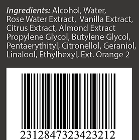
FDA laws and regulations required the perfume box exhibit a USPC barcode and ingredient list. I researched typical perfume ingredients and the required barcode size, so that my package would be compliant.
Branding
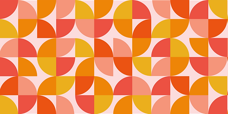
While I waited for my perfume bottle to arrive, I worked on the design and branding. I designed with a geometric pattern in mind from my initial sketches. I later chose a color palette that worked well with this pattern.

Color Palette
This perfume box was to have citrus ingredients, so I wanted to reflect that with the shapes in the geometric pattern. These warm colors gave a 'fruity' aesthetic and would stand out on a dull store shelf.
Typography
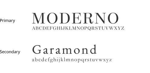
I chose easy-to-read typefaces with a modern twist to match the straight lines of the geometric pattern.
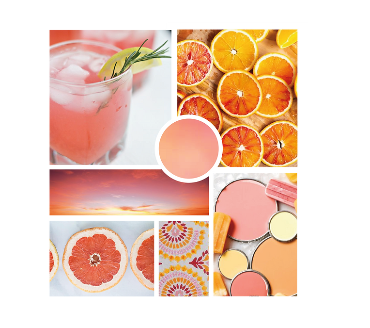
Mood board illustrating Lueur's bright and acidic color and style.
Packaging
Once my pattern and initial color scheme was chosen, and my perfume bottle had arrived, I had to combine all the elements.
Citrus Sensations

I utilized Esko Studio to digitally preview my designs on the dielines in a 3D rendering.
Concept
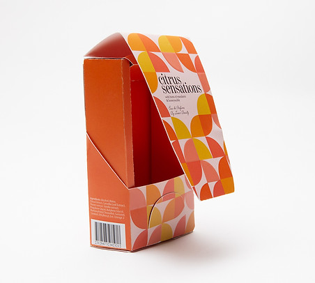
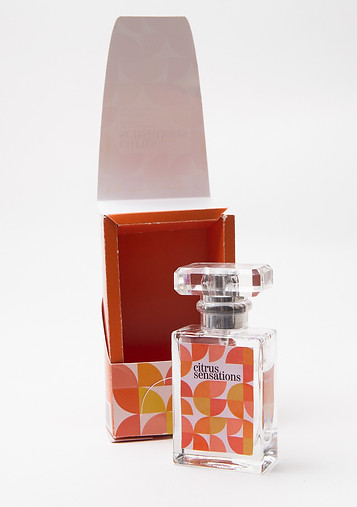
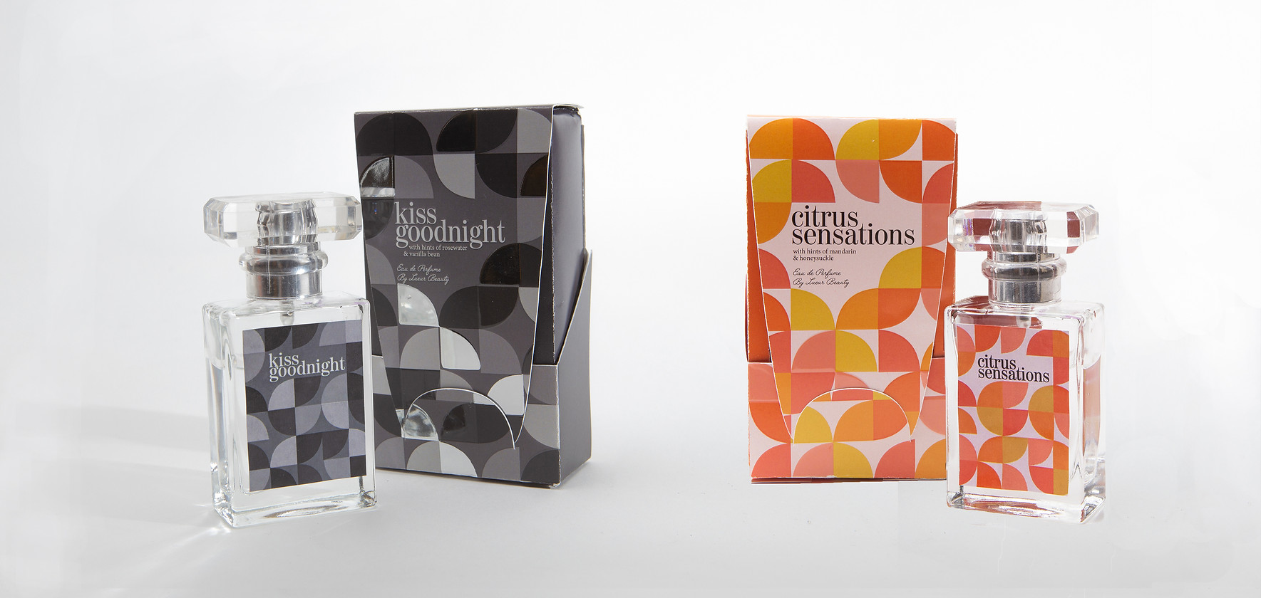
Introducing Citrus Sensations, a brightly colored orange and yellow themed box that smells of sweet mandarin and honeysuckle. I visualized this box being sold at a department store, and the target market would be young women aged 15-25 years. This bright packaging would grab consumer attention.
Spot Varnish
This package showcases spot varnish intermittently throughout the geometric pattern. Cal Poly allowed our class to use an MGI 3DS with IFOIL for this project, and I wanted to take advantage of this opportunity to incorporate spot varnish in my project.

Design Revision
During the class critique my design was praised. However, it was noted that the judges of the competition were likely to be white males over 40 years of age. Given that factor, I decided to create a second box, for an additional scent, using a more mature color palette.
Kiss Goodnight

I utilized Esko Studio to digitally preview my designs on the dielines in a 3D rendering.
Concept
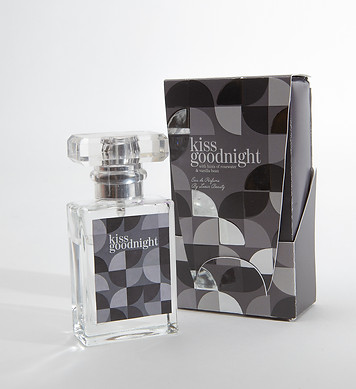
Welcome to Kiss Goodnight, a darker more sophisticated take on the Lueur Beauty brand. This rosewater and vanilla scent is targeted to an older age group than Citrus Sensations. Purchasers are likely in the 21-35 year range. I ended up choosing this packaging to submit to the PIASC competition.
Foil & Varnish
This design uses both foil and varnish on areas of the pattern to catch attention in a more refined way. Despite lacking bright colors, the shiny foil on the package will be eye catching, while also looking more expensive and luxurious.
This box was originally designed to have gold foil. Unfortunately, Cal Poly ran out of gold foil for the MGI, and thus silver foil was used. The silver foil did not give the same effect, and blended in more with the black and grays of the design. While initially this seemed like a setback, clearly the judges of the competition felt it was still an impressive design.


Labels & Printing
Design
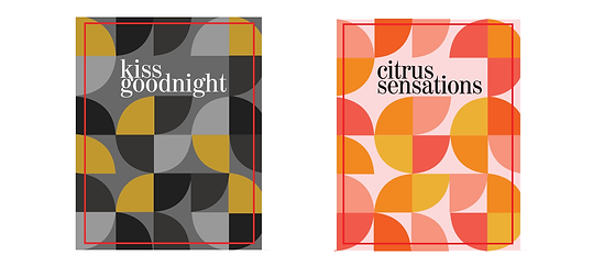
Since the competition required labels for the perfume bottles, I created simple labels with the same repetitive pattern from the boxes. They also used varnish and foil to match their respective boxes.

File Preparation & Printing
First, I printed CMYK on a Konica Minolta printer with special registration marks. Then, using the MGI, I ran my files a second time to print foil, and then a third time for the spot varnish. I had to appropriately name my layers and swatches so the MGI would accept the files. Since the files had to be run 2-3 times, registration was not perfect. After printing, our class used an Esko Table to cut our boxes according to their dielines.
Thus, separate files were needed for CMYK printing, spot varnish, foil, and dielines for both two part boxes and their labels. This resulted in 18 files for this project.
Product Photography
